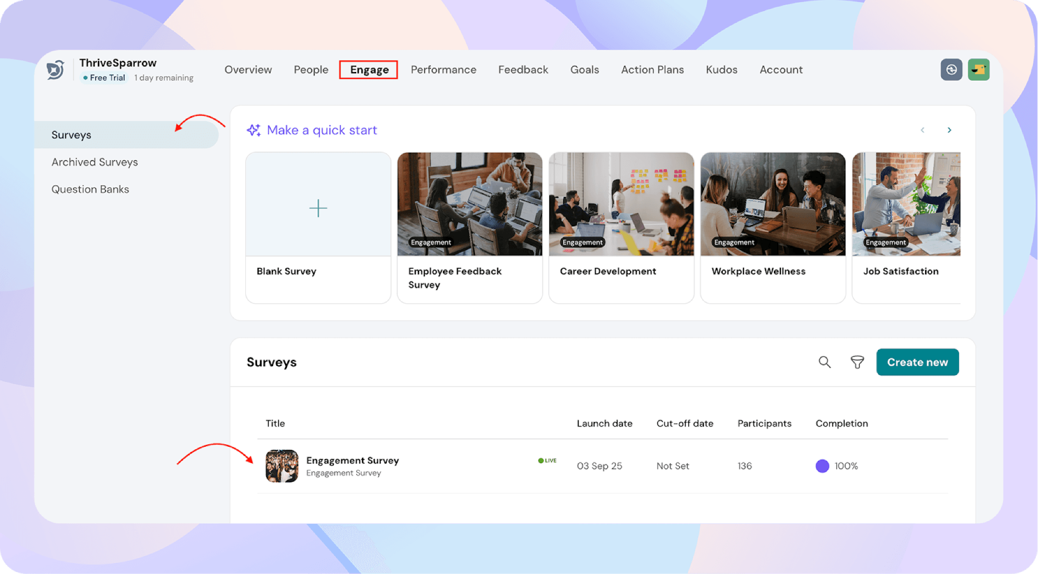
Search
Introducing the new PPT Export option in the Engagement module, which allows you to quickly download survey insights in a presentation-ready format. This makes it easy to share results with leadership, managers, or teams.
How to Download a PPT Report
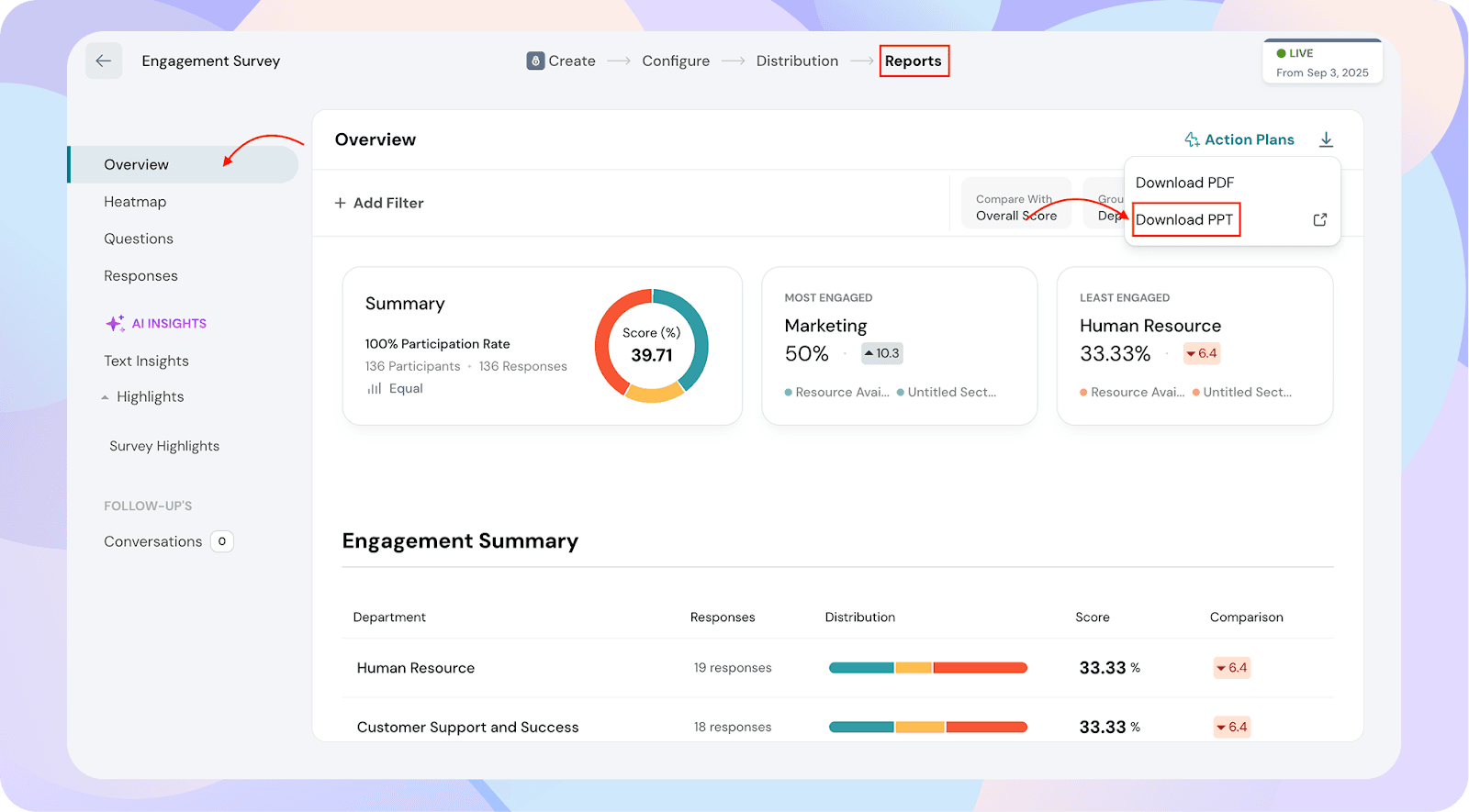
You can now download the pre-generated report or configure it to match your needs. You can also save the PPT and access it later if needed.
This flexibility lets you create a PPT tailored to your audience.
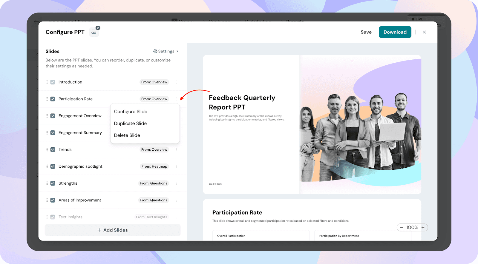
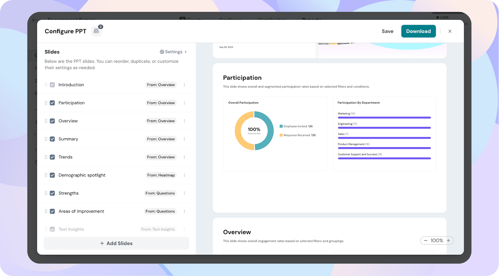
Slides in the PPT Report
The Participation slide gives you a clear view of who actually took part in the survey. It shows the overall participation rate (invited vs. responded) and breaks it down by demographics such as department or role. This helps leaders quickly identify which groups are highly engaged in giving feedback and which groups may need a reminder or nudge to participate.
The Overview slide captures the overall health of employee engagement in your organization. It displays the company-wide engagement score, splits responses into favourable, neutral, and unfavourable, and spotlights the most and least engaged groups. It’s designed to provide a snapshot of where your culture currently stands.
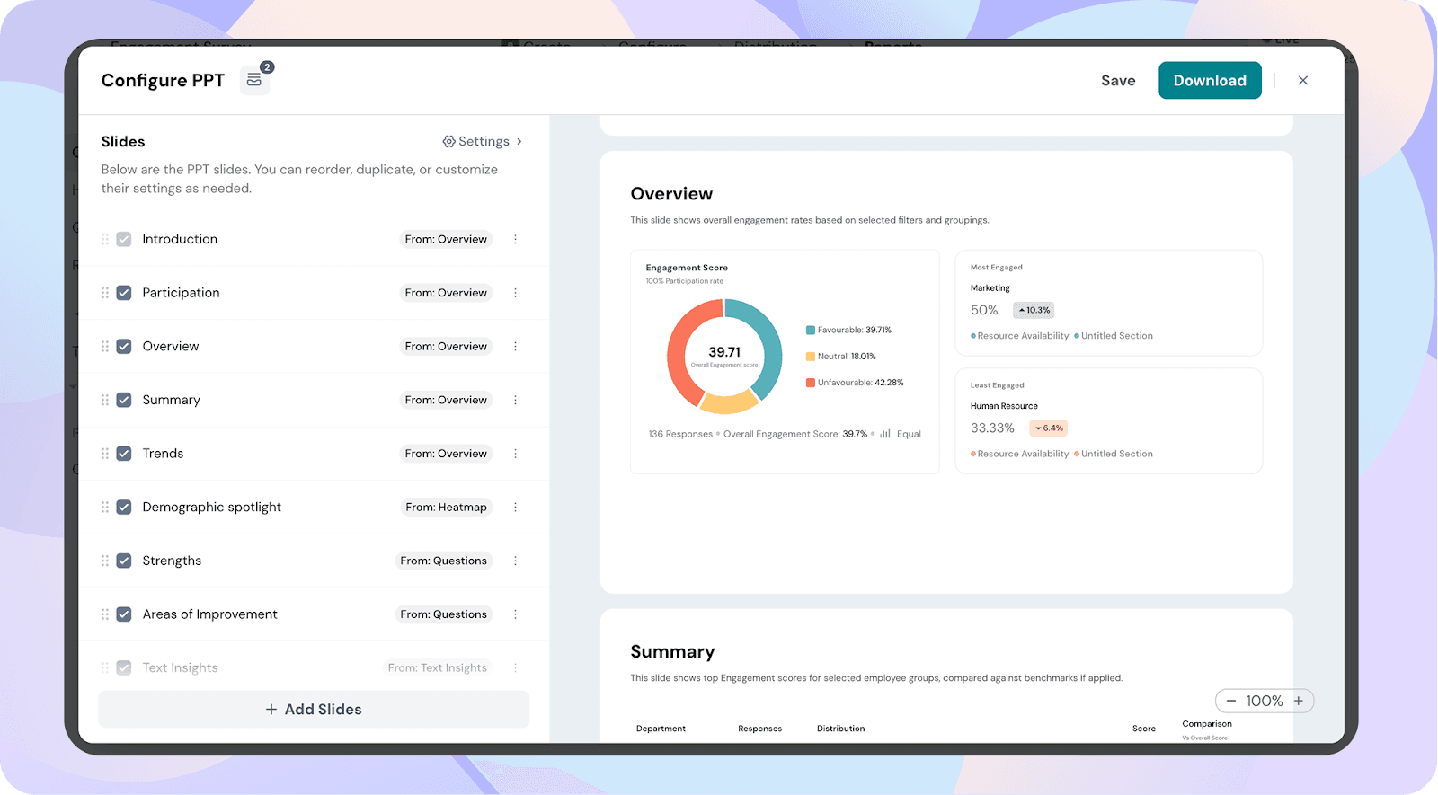
The Summary slide drills deeper into engagement scores by your chosen demographic view (like department or role). It provides response counts, favourable/neutral/unfavourable breakdowns, and compares each group’s score against the overall benchmark. This makes it easier to see how individual teams stack up against the bigger picture.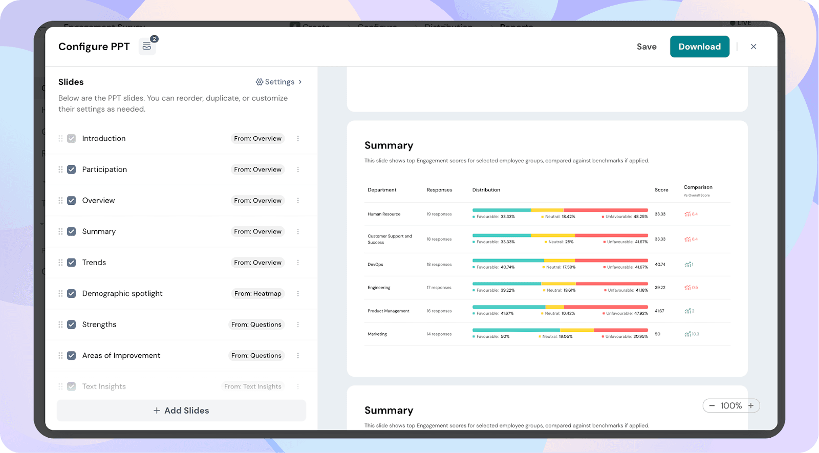
The Trends slide tracks how engagement shifts over time. By comparing results from up to four past surveys alongside benchmarks, you can see whether your engagement efforts are improving, holding steady, or declining. It’s particularly useful for measuring the impact of initiatives or leadership changes.
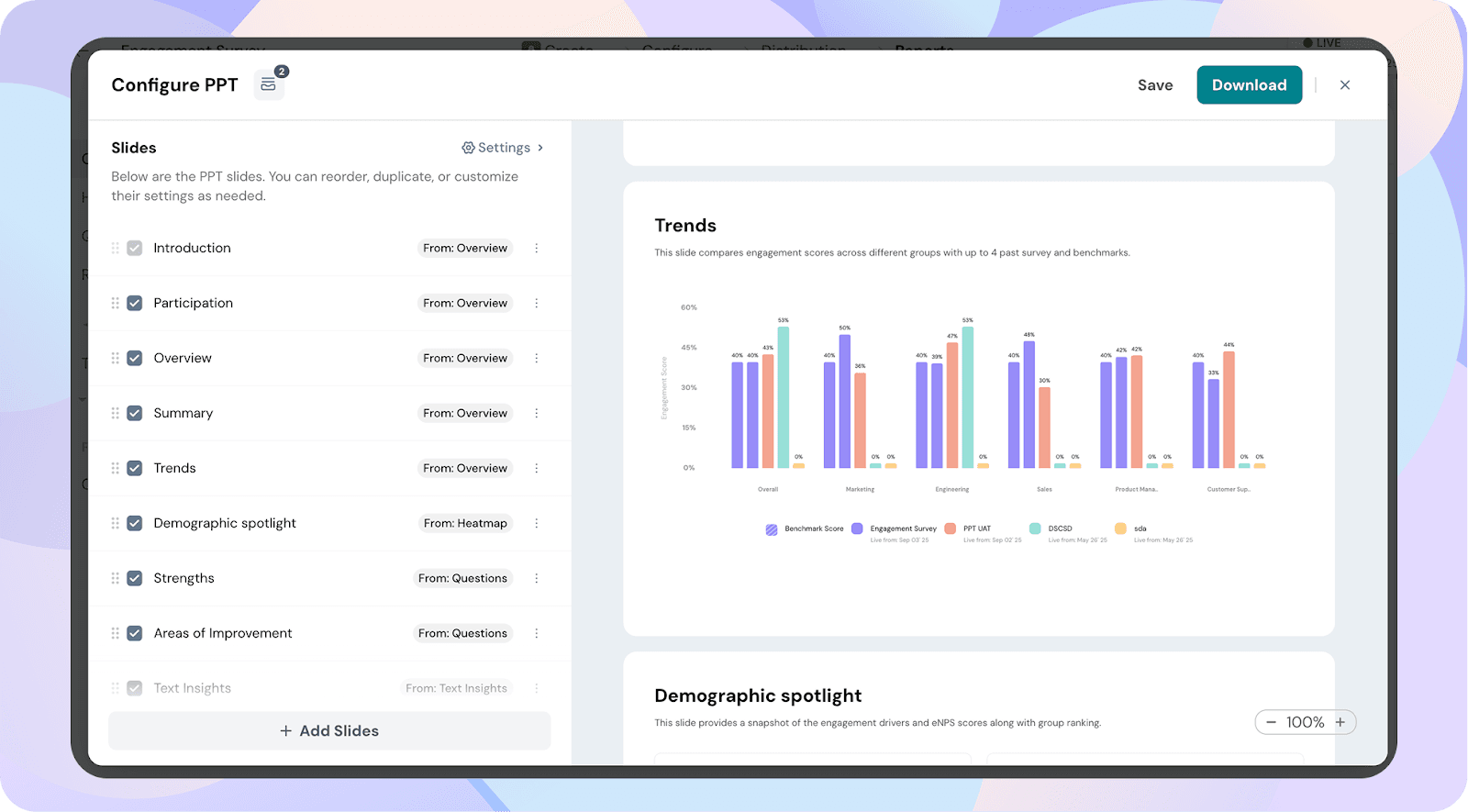
The Demographic Spotlight shines a light on engagement across key demographics. It shows which groups are thriving, which are struggling, and the top- and bottom-scoring questions within each group. This helps leaders pinpoint specific teams or roles that need more support and attention.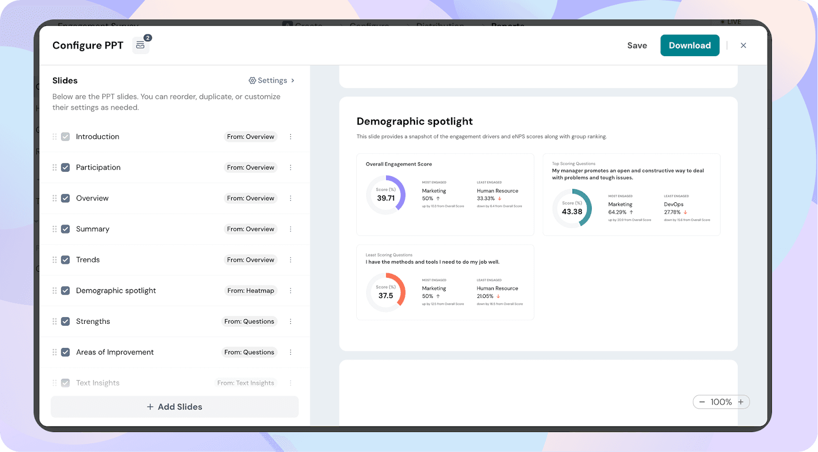
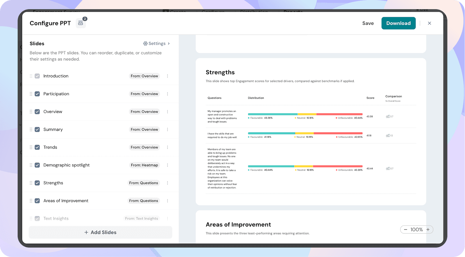
The Strengths slide highlights the survey drivers (questions or topics) with the highest scores. It displays favourable, neutral, and unfavourable percentages and benchmarks them against overall company scores. This reinforces what’s working well in your culture so those practices can be celebrated and scaled.
The Areas of Improvement slide identifies the lowest-performing drivers from the survey. It shows distribution, overall comparisons, and highlights critical areas where leadership should take action. This slide makes it clear where change is most urgently needed.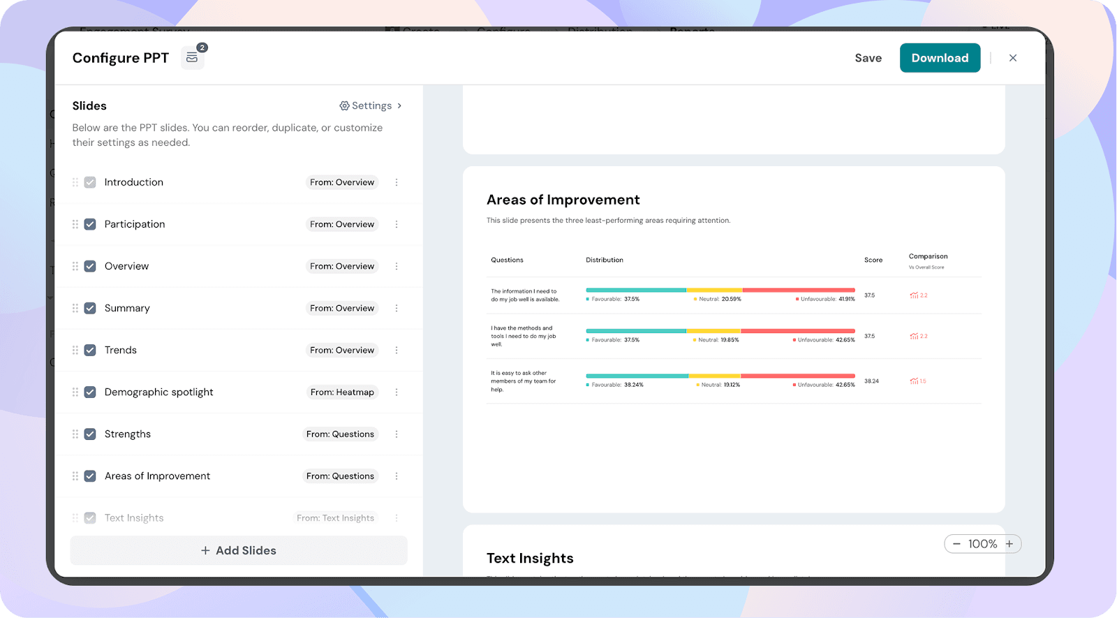
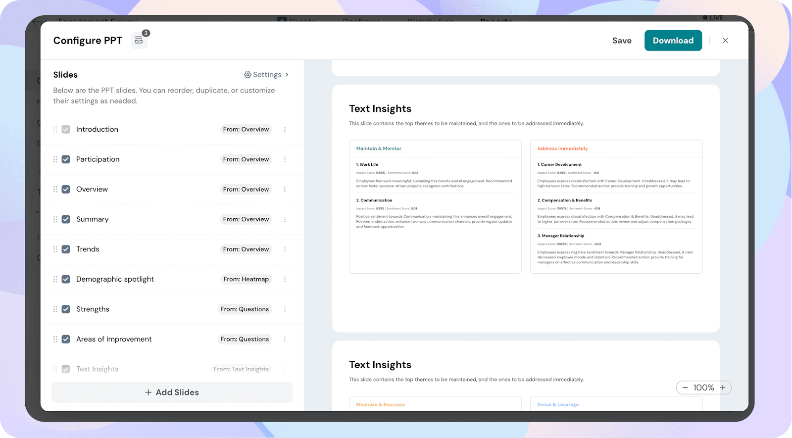
The Text Insights slide takes employee comments and transforms them into themes that provide context behind the numbers. This helps leaders understand not just scores, but employee sentiment.
Categorized into four buckets:
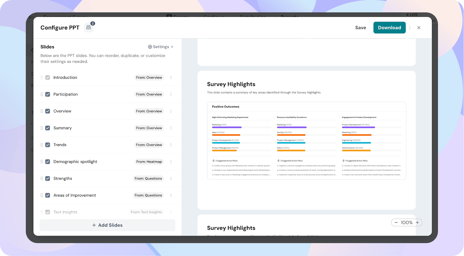
The Survey Highlights slide pulls everything together into a clear summary of key outcomes. It clusters results into themes like high-performing departments, resource strengths, and functional engagement wins. Each highlight is paired with suggested action plans, giving leaders ready-to-use direction for next steps.
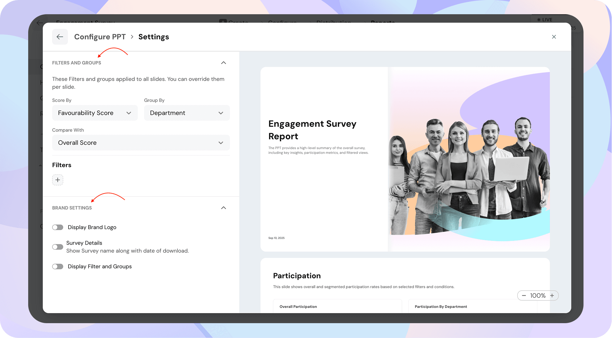
The Settings page lets you configure filters, groups, and branding options for your PPT report. These settings apply across all slides, but you can override them for individual slides if needed.
While most slides follow the common settings (Score By, Group By, Compare With, Filters), a few slides have unique options worth noting:
Powered By SparrowDesk