Search
Infer AI - Survey Highlights:
Survey highlights simplify survey data into actionable insights, helping you understand what’s happening at a glance and enabling you to take meaningful actions. Here’s how you can navigate and use this feature effectively.
Accessing Survey Highlights
Log in to your ThriveSparrow account.
Open the survey for which you want to view the report.
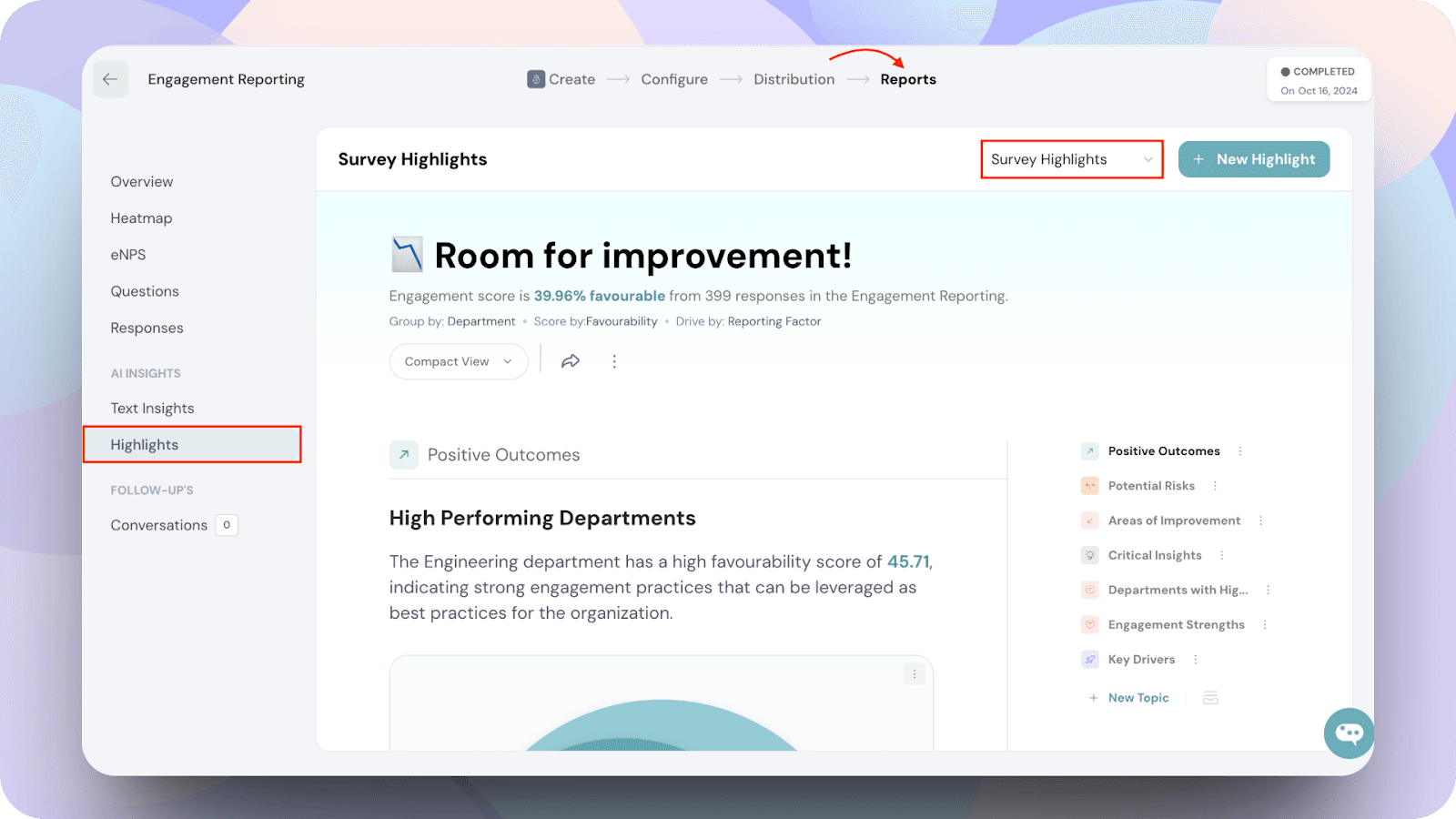
Navigate to the AI Insights section and select Highlights.
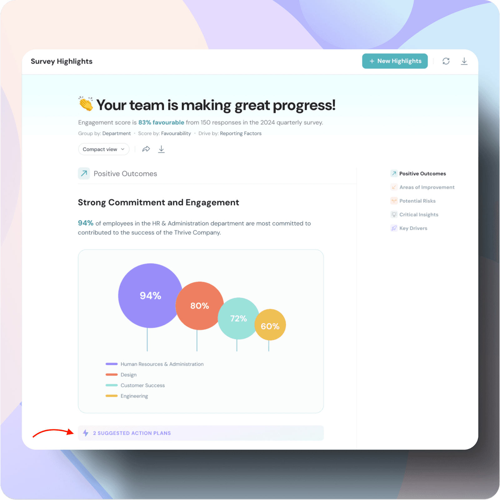
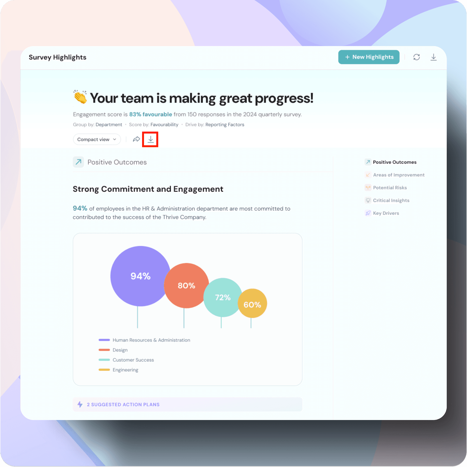
You will now see the Survey Highlights Report generated by Infer AI.
The default report is automatically generated upon first access with the following default filters:
You can also download and share the report by clicking on the respective icons , which are covered in a later section of this article.
The report offers two views: Compact View and Detailed View.
To switch between the compact and detailed view, click on the dropdown and select the desired one.
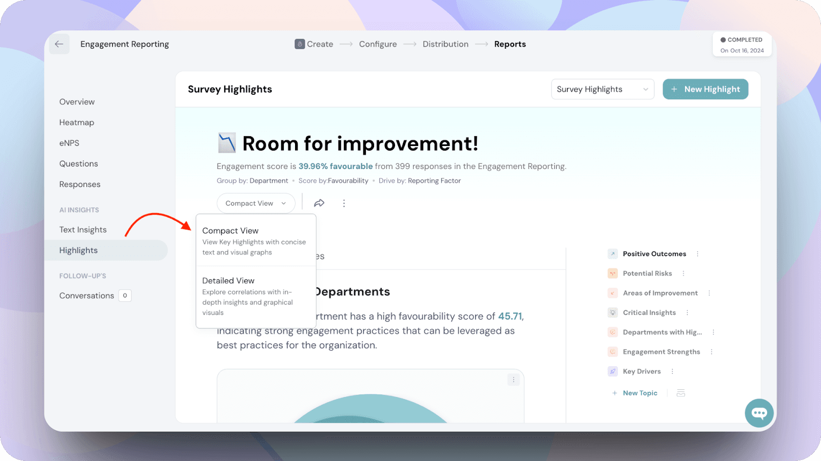
The Compact View displays the default report with concise text and visual graphs, while the Detailed View provides a comprehensive breakdown of each graph, offering in-depth insights.
Compact view
Detailed view
First, let’s discuss the survey highlights reports.
Key sections in Survey Highlights
The survey highlights are broken into five sections, each designed to provide actionable insights:
This section identifies what is going well within the selected group or demographic. It highlights:
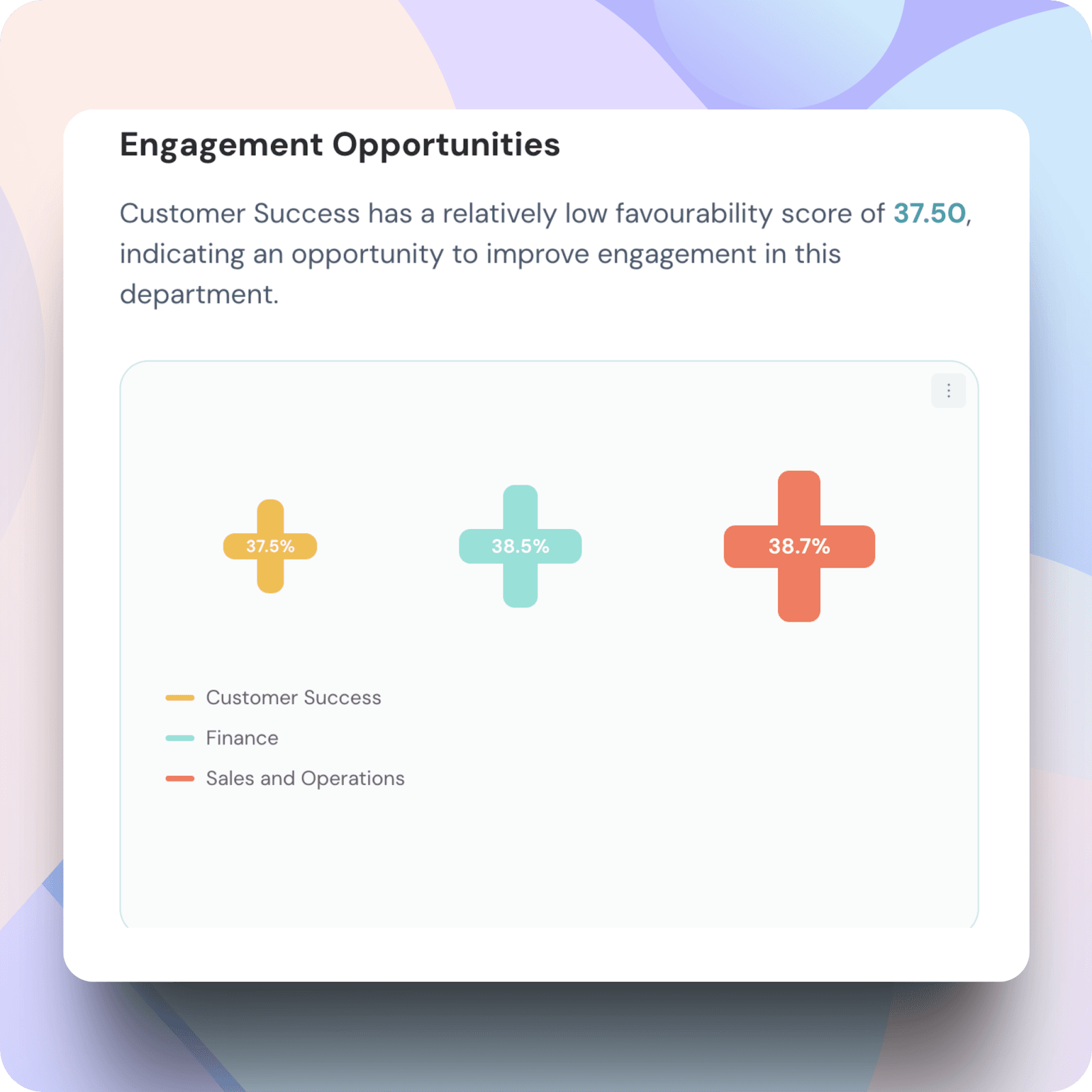
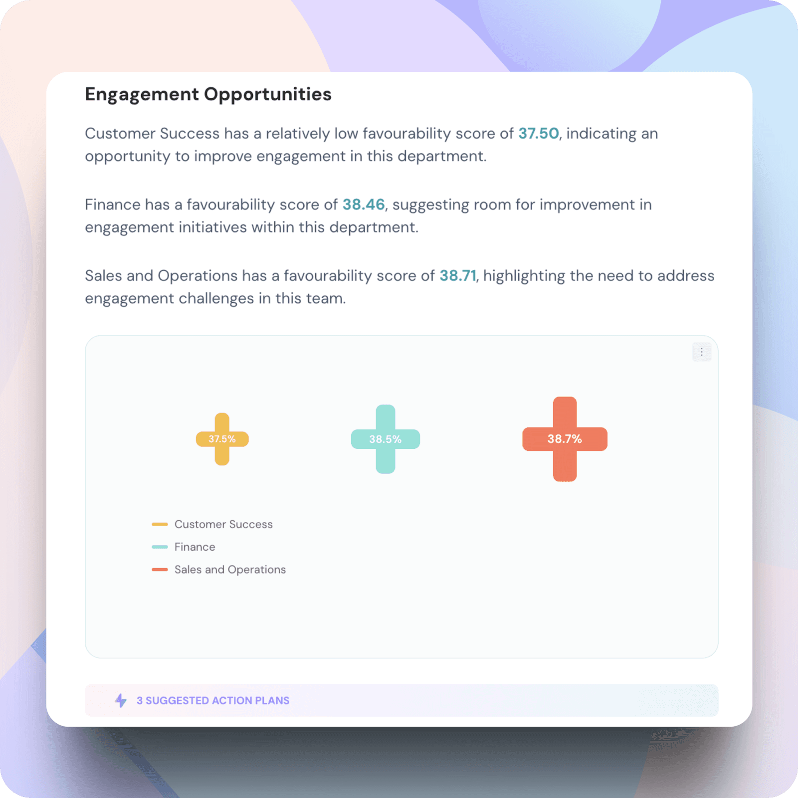
This section focuses on areas that need attention. It highlights:
This section flags areas that could pose a risk in the future. It identifies:
This section emphasizes the most important findings critical to organizational success. It highlights:
This section pinpoints the most influential factors contributing to the overall survey outcomes. It highlights:
Key Drivers- In detail
Under Positive Outcomes, topics of reports are generated based on responses which are driven by questions or reporting factors(which you use).
Under Positive Outcomes, there are three subsections: Strong commitment & engagement, leadership and engagement(which are auto generated).
Since the data is grouped by department, these reports compare your department with others in the organization, providing a consolidated view.
Note:
We have explored the Positive Outcomes section in detail to provide a clearer understanding.
Similarly, for all key sections in the reports which includes positive outcomes, areas of improvement, potential risks, critical insights, key drivers- three such corresponding sub-sections are generated.
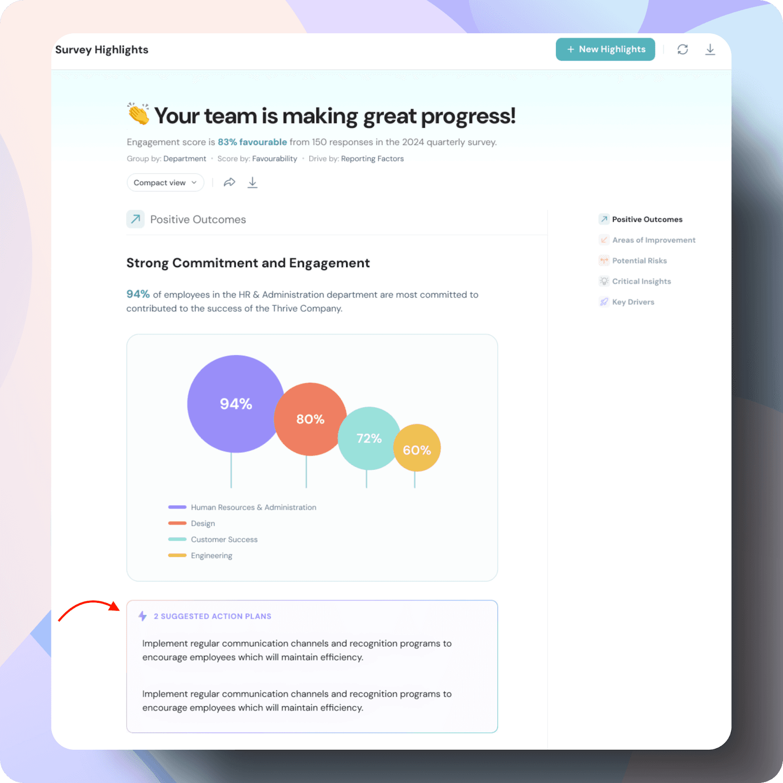
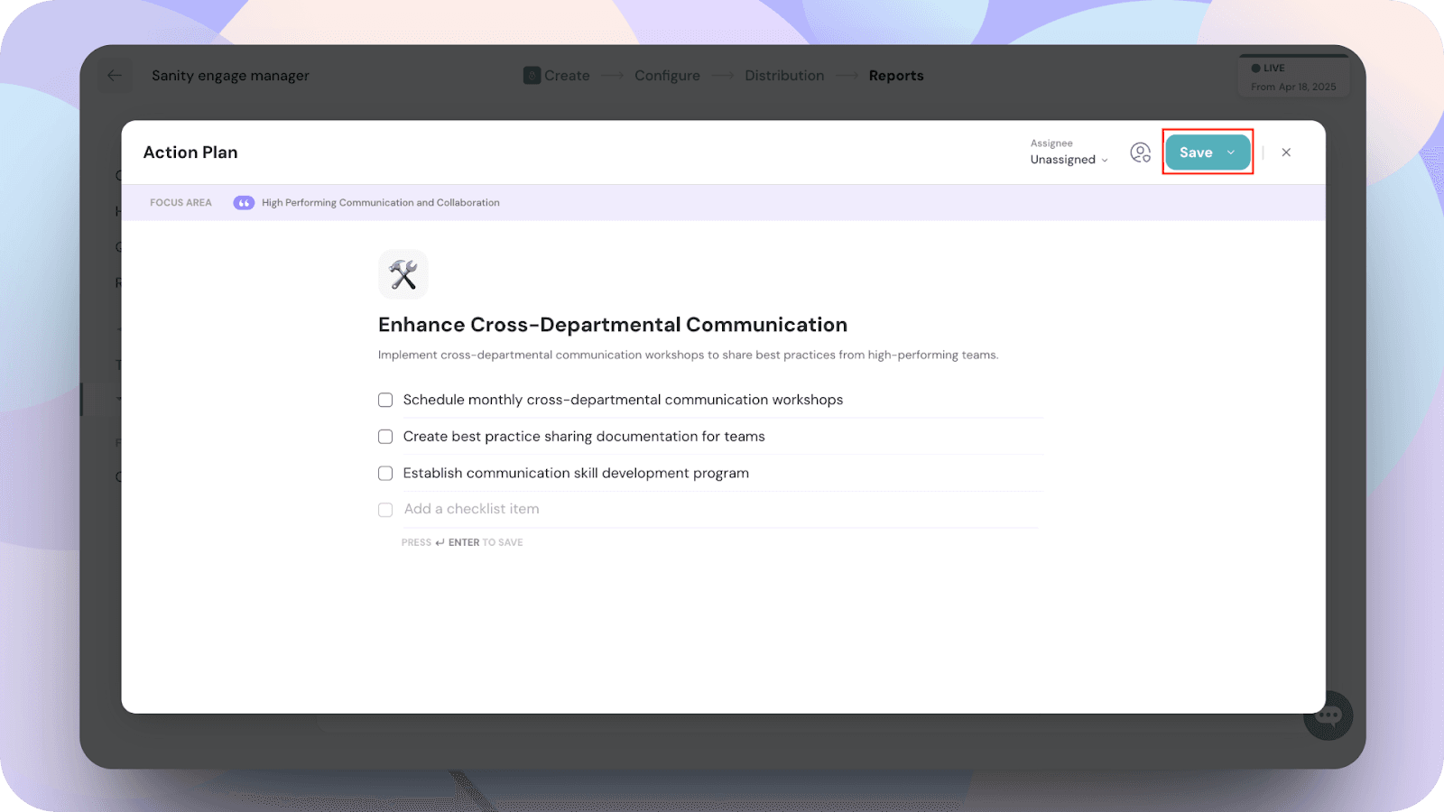
Action Plan Creation
To view and create action plans, click on the “ 2 suggested Action Plans”
Note: These recommended action plans are generated by default using AI
You will be able to view the recommended action plans
Double click on one of the action plans to edit it, include your own action items and click save.
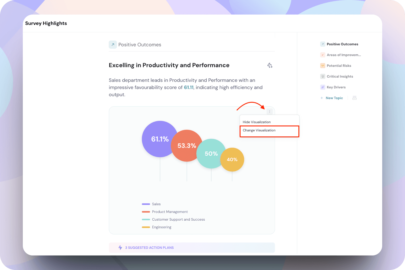
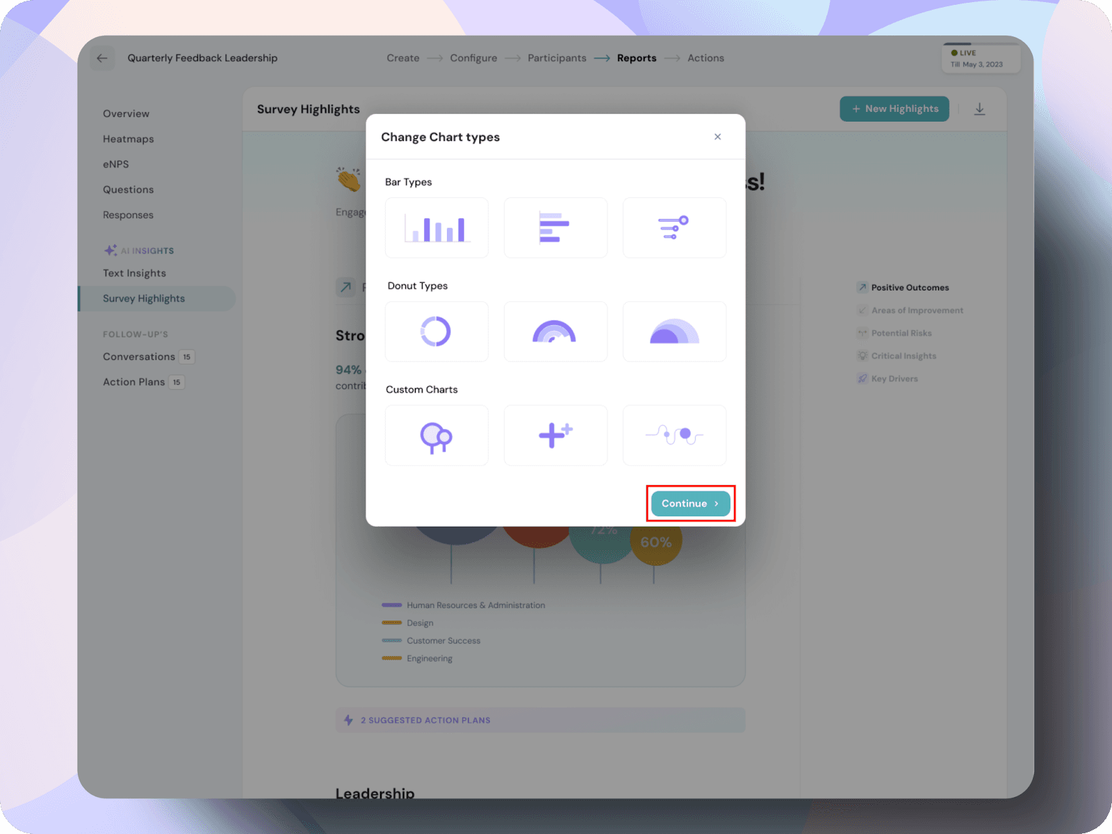
Change Visualization
To change the visualization,
In the pop-up window, choose your desired chart type and click Continue.
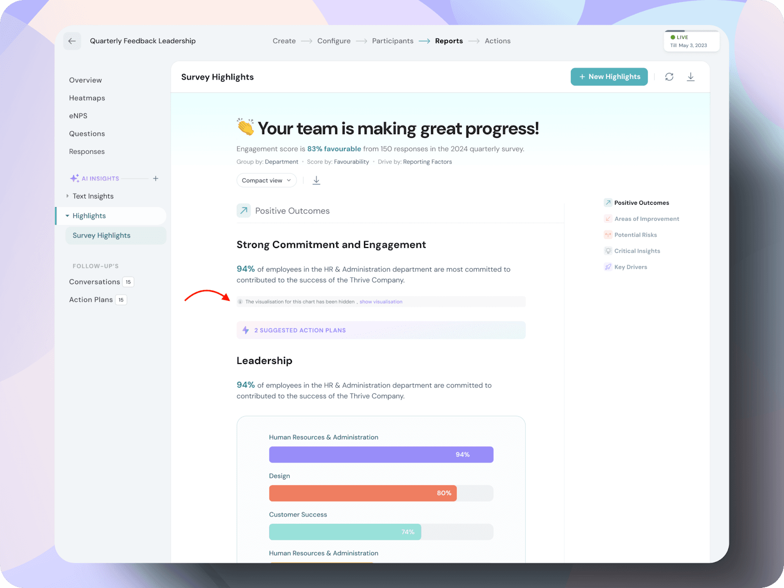
To hide a visualization, click Hide Visualization from the dropdown menu. The chart will be hidden from view.
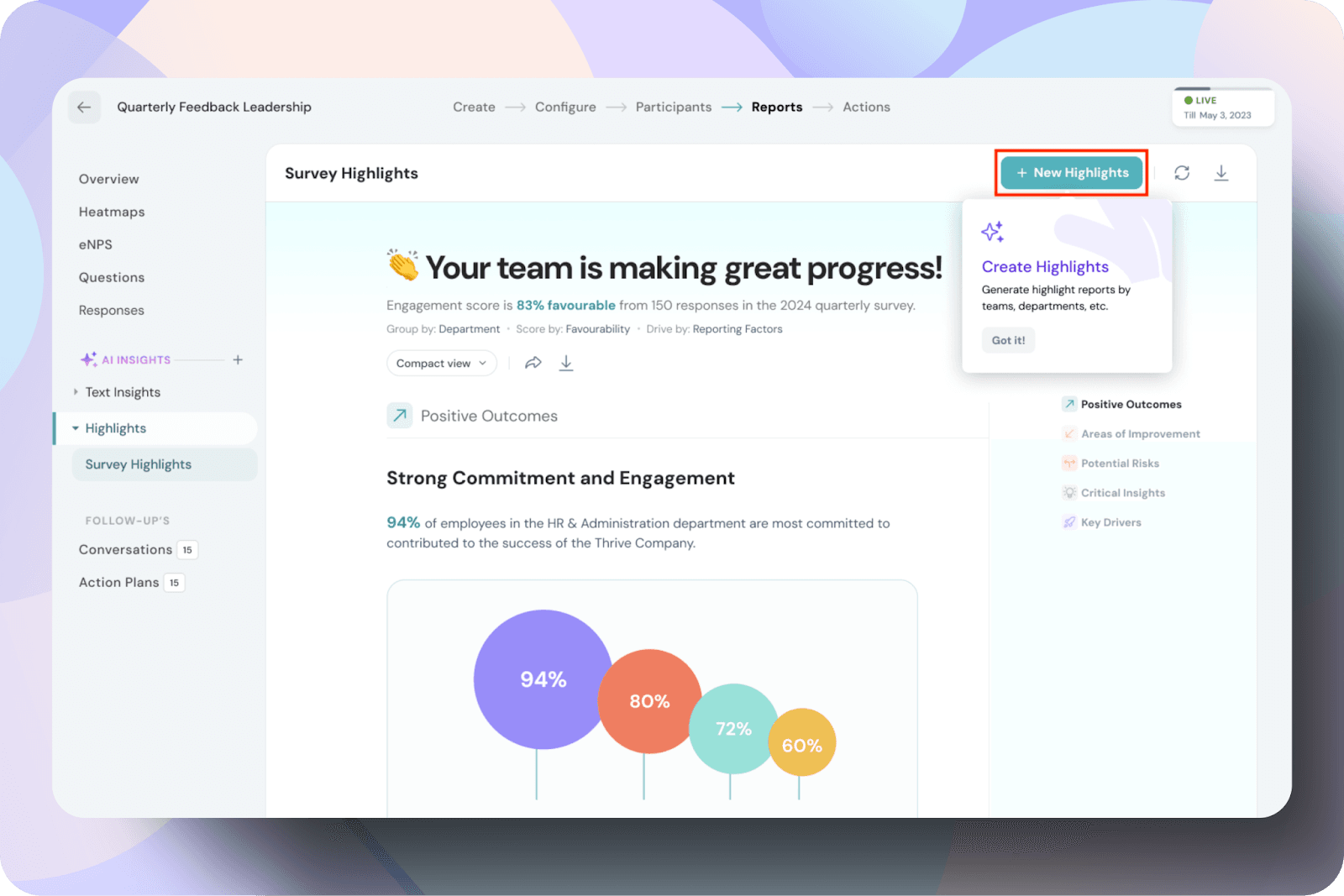
New highlight creation
To create a new highlight by yourself,
Click on the new highlights in the top right corner,
In the Create New Highlights modal,
Within the Choose Settings tab, you can personalize your report by adjusting the following options:
Choose how you want the data grouped. Options include:
This flexibility allows you to focus on specific groups to derive actionable insights.
Note: Grouping works by comparing the selected groups against each other for each topic in the survey.
Select the scoring method to view your results:
You can toggle between these options based on your preference or requirements.
Determine how insights are generated:
Both options help you identify key trends, but reporting factors provide a broader overview, while questions focus on specifics.
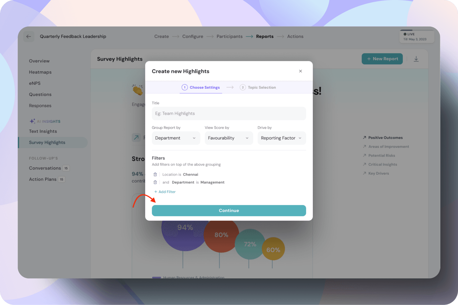
Note: All the settings configured on this page must be completed before the report is generated. Once the report is created, these settings cannot be changed.
You can customize the topics displayed in the reports by toggling the checklist icon on or off. Simply select the icon and enable the topics you want to include in the report, and click Generate Highlights.
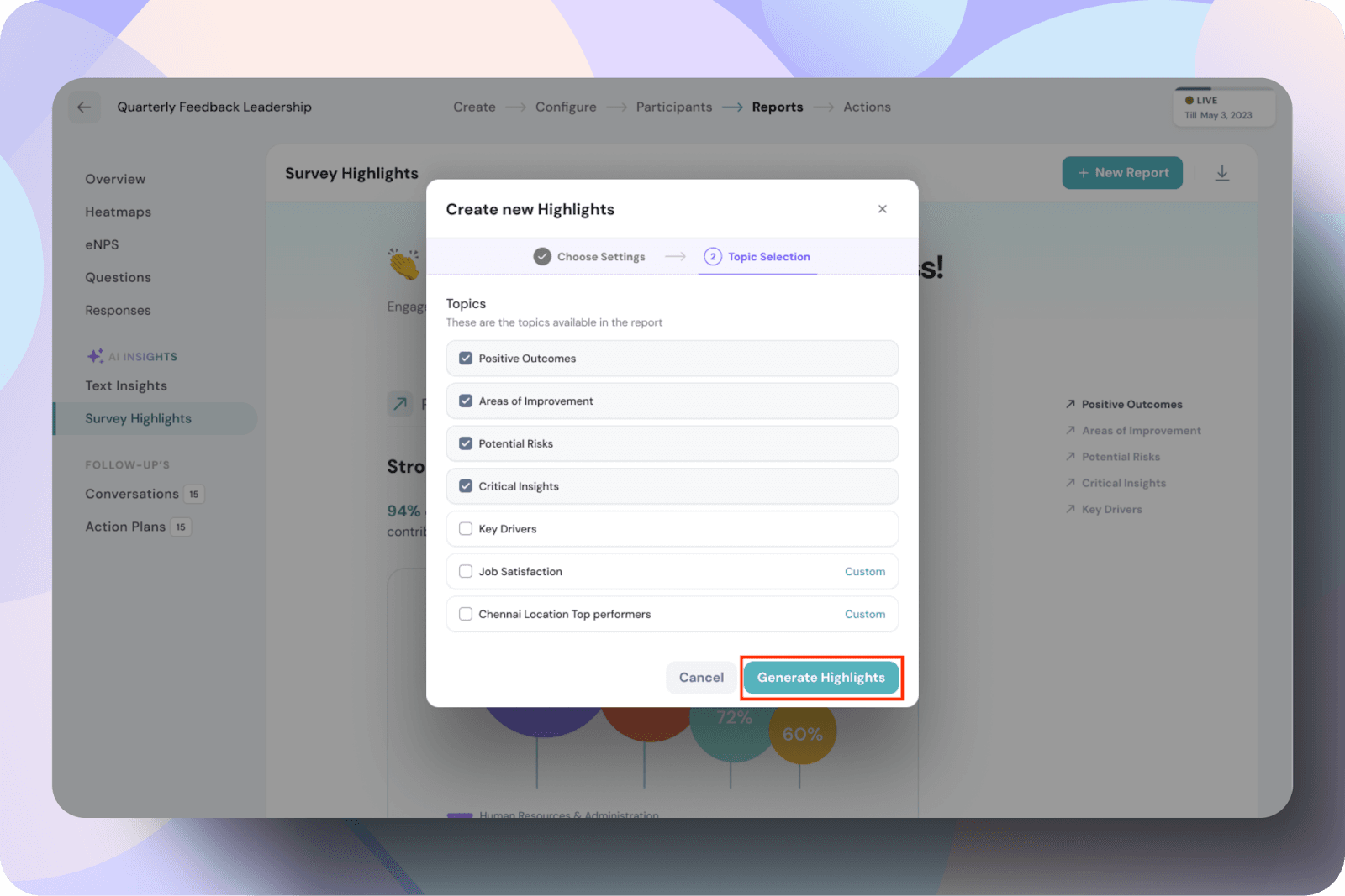
You will see a "New highlights report generated" message, indicating that the changes have been applied. The updates will be reflected in the reports.

New topic creation
Click on the new topic icon.
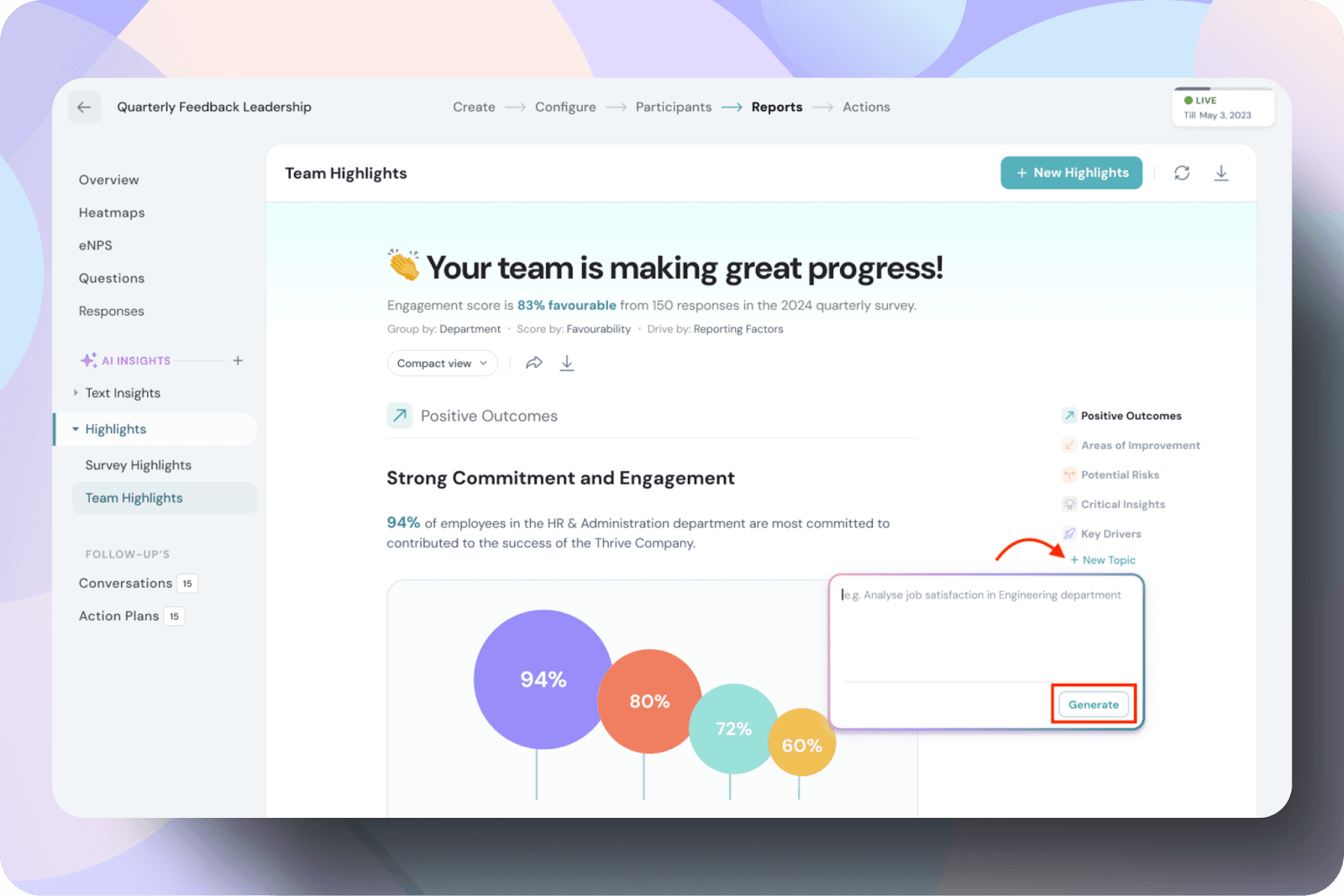
In the pop up, enter the desired prompt and click generate.

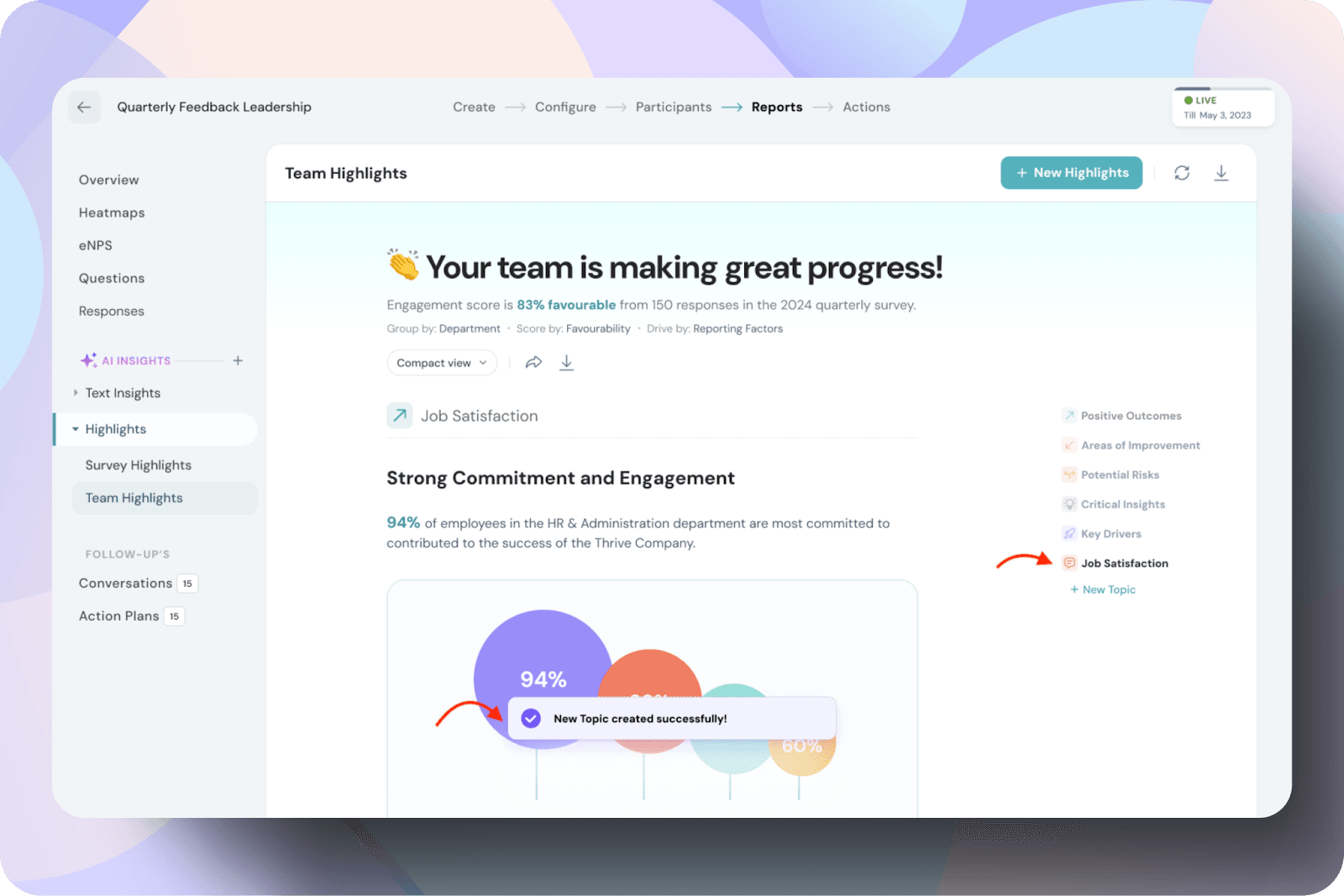
The topic generated is added to the section and will be visible in the report.
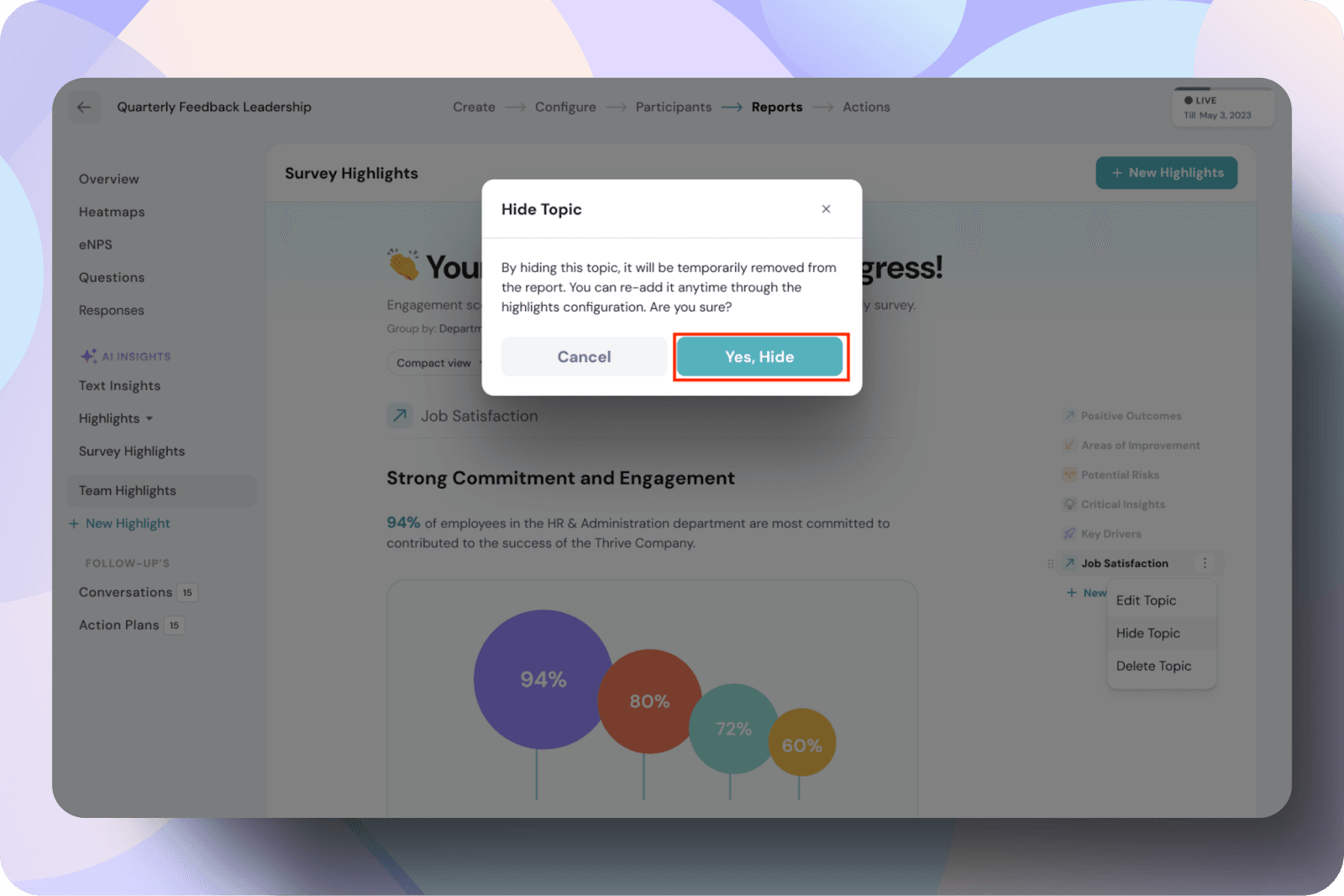
Next to the newly created topic Job Satisfaction (used here as an example) , click on the three dots menu. From there, you can choose to Edit, Hide, or Delete the topic.
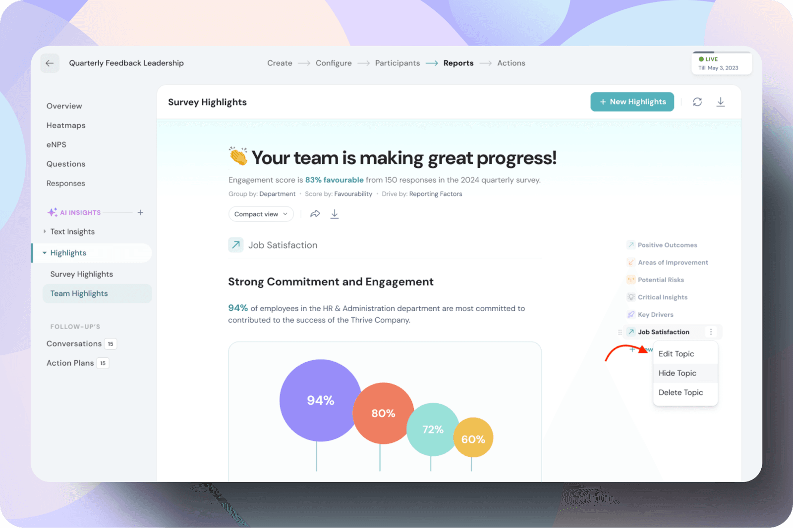
By clicking hide, you will be prompted with the hide topic box, click yes, hide button.
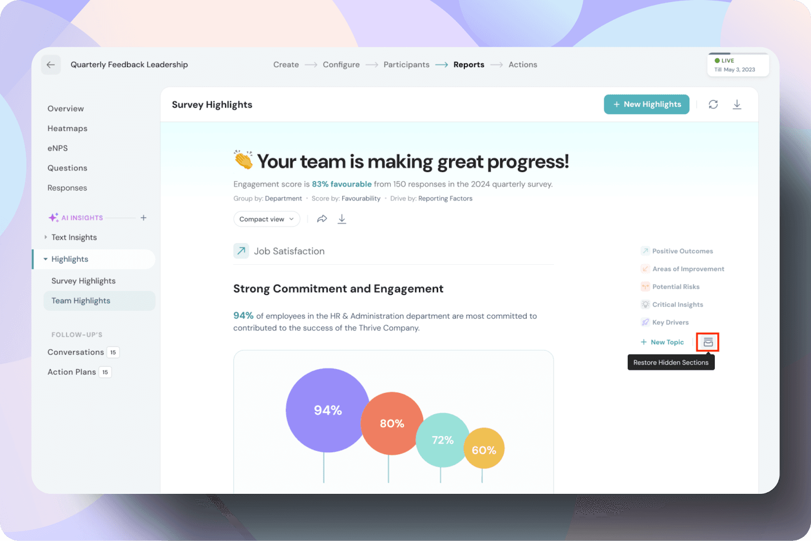
Once the topic is hidden, you can restore it by clicking on the box icon next to the topic, such as Job Satisfaction.
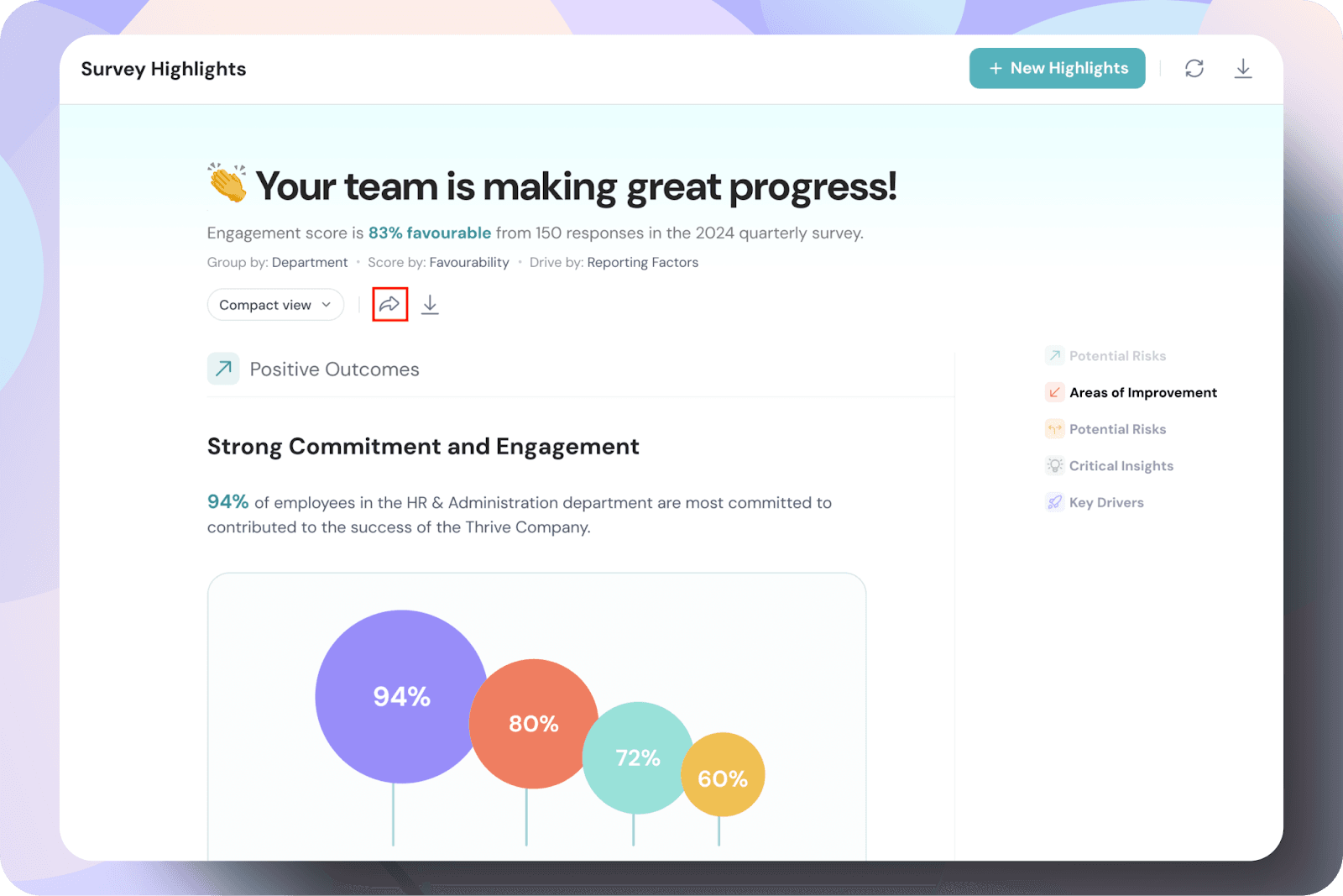
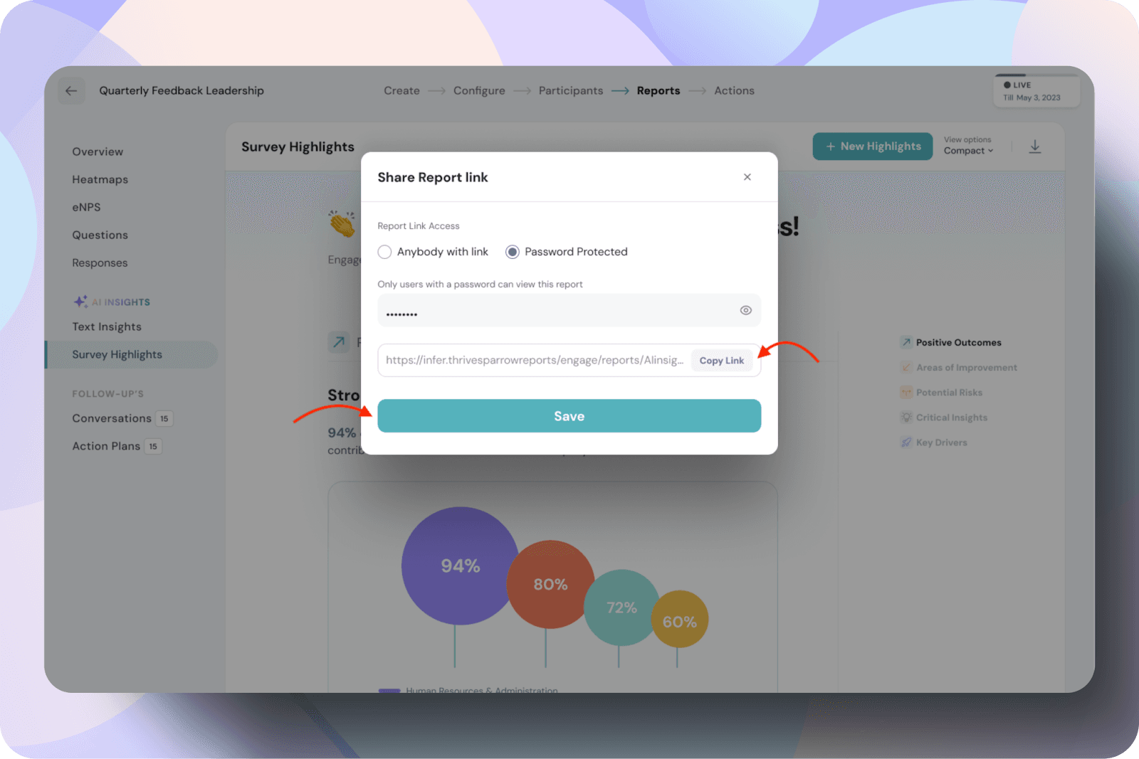
Share and Download the report
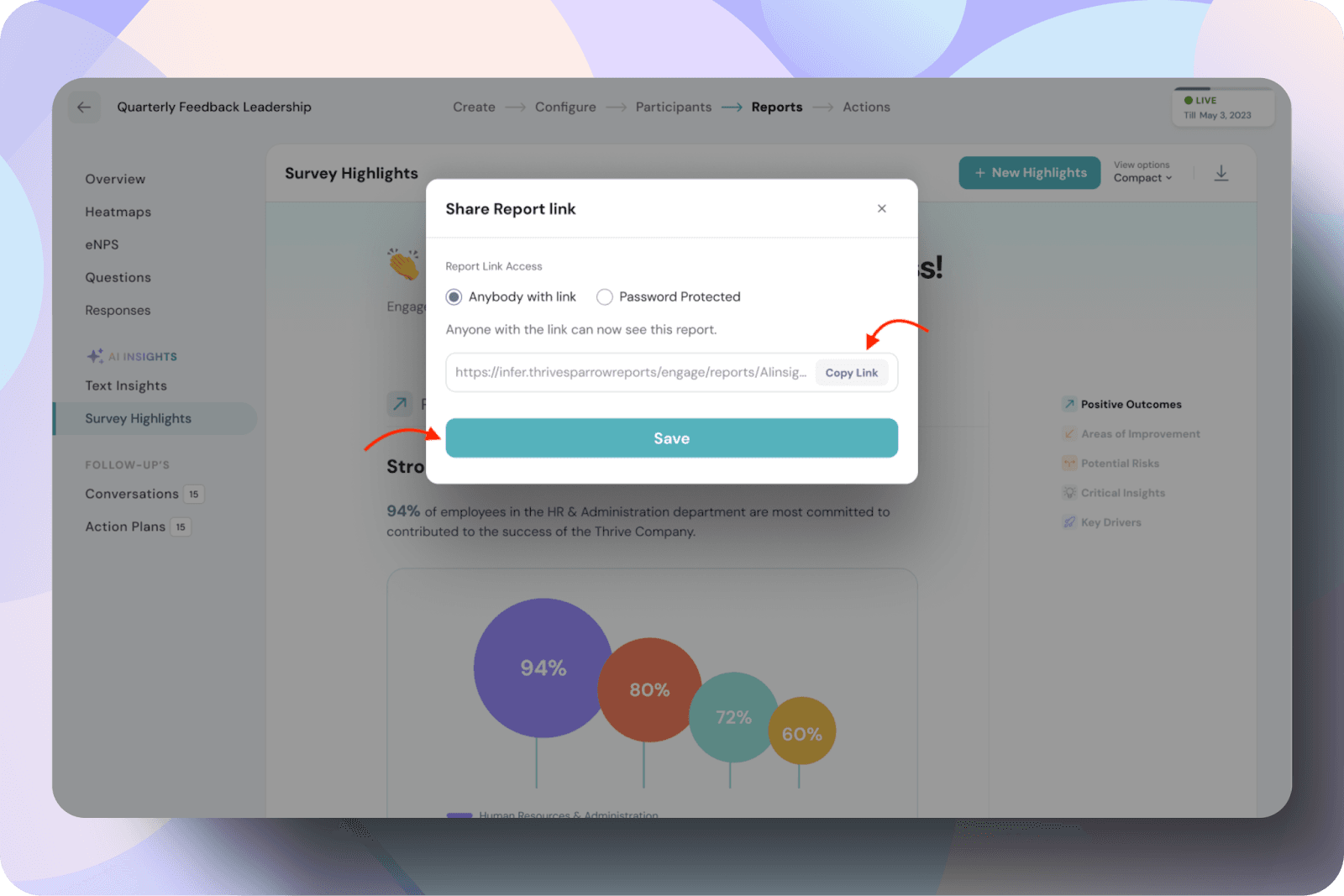
To share the report, click on the share icon.
In the Share Report Link pop-up, there are two sharing options:
To download the report, simply click on the download button. The report will be saved to your device as a PDF.
Powered By SparrowDesk