Custom widgets are here to take your performance reports to the next level as you now have complete control over how your reports look and feel. You can customize reports to suit your comfort level by deciding which sections to add, what order they should appear in and even adding extra sections if needed. This means you’re in charge of creating reports that are tailored exactly to your needs and preferences.
Let’s walk you through everything you need to know to make the most of custom widgets and create polished, engaging reports effortlessly.
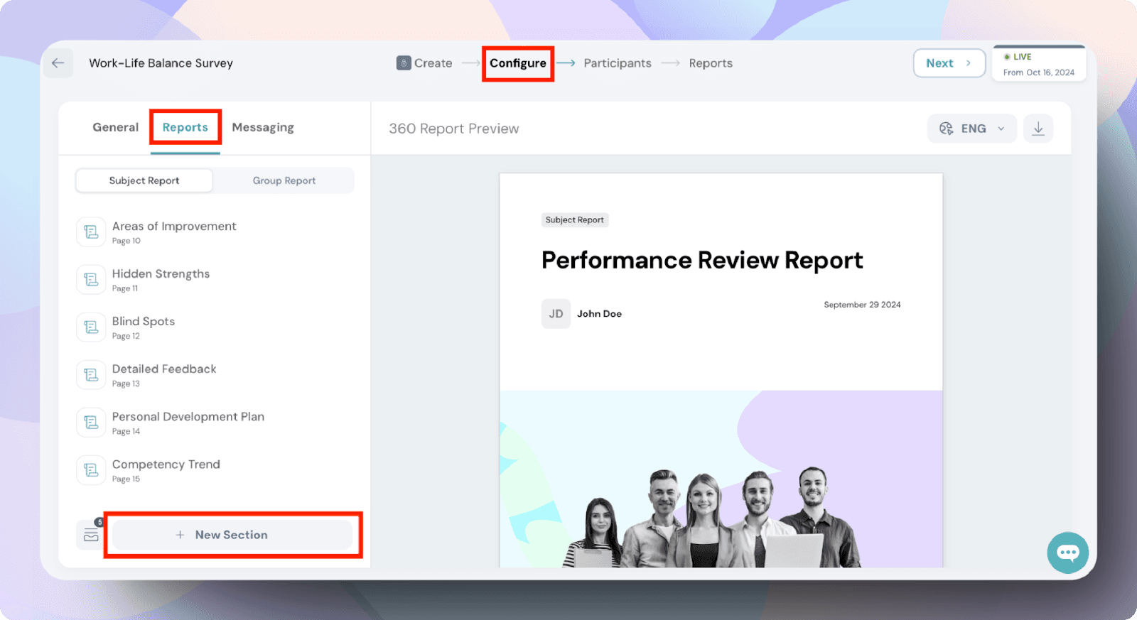
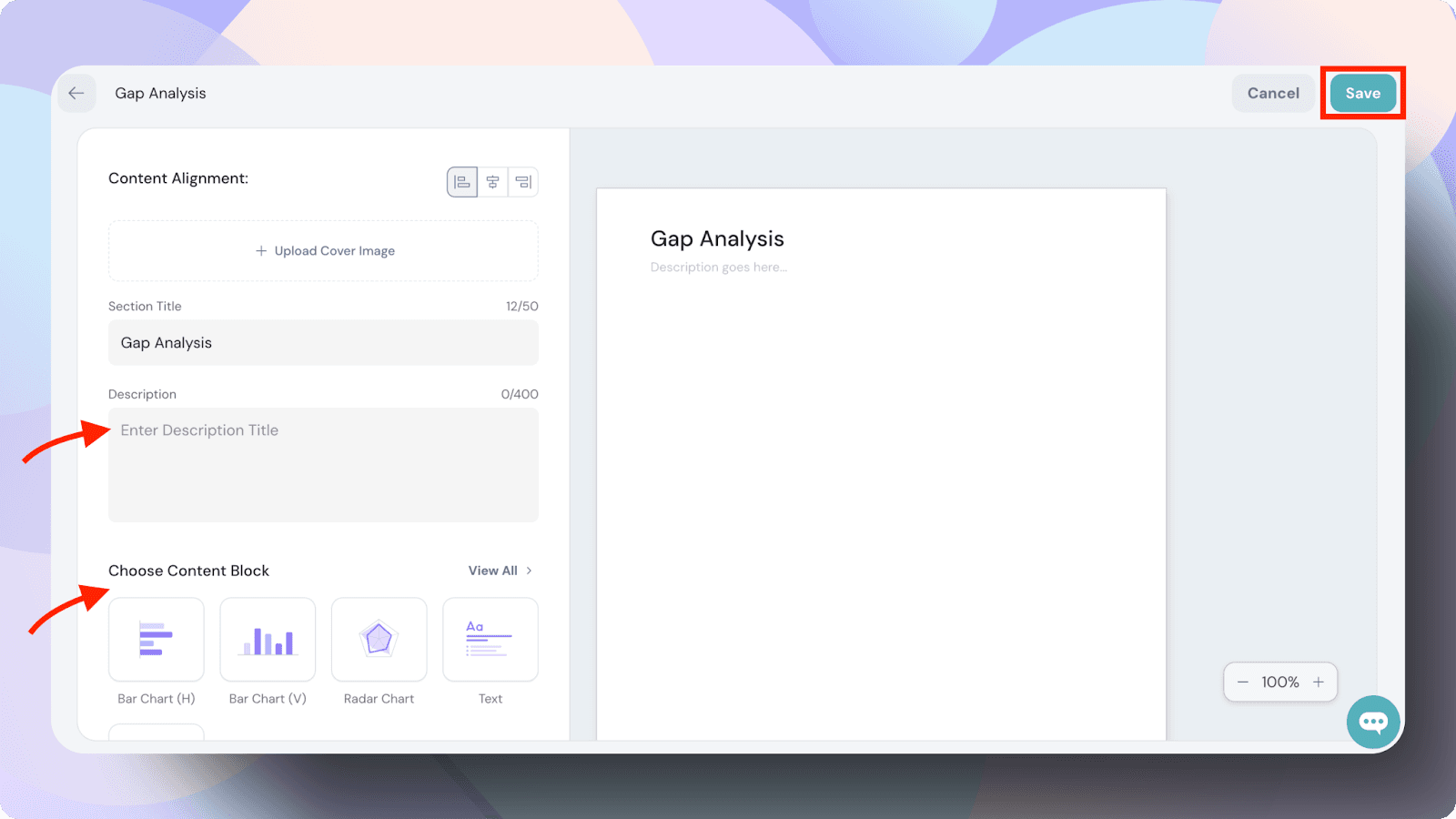
Step 1: Access custom widgets
Go to the Performance section in your dashboard.
Click on Configure > Reports to explore the layout customization options.
Click on + New Section.
Enter the relevant information for the new competency.
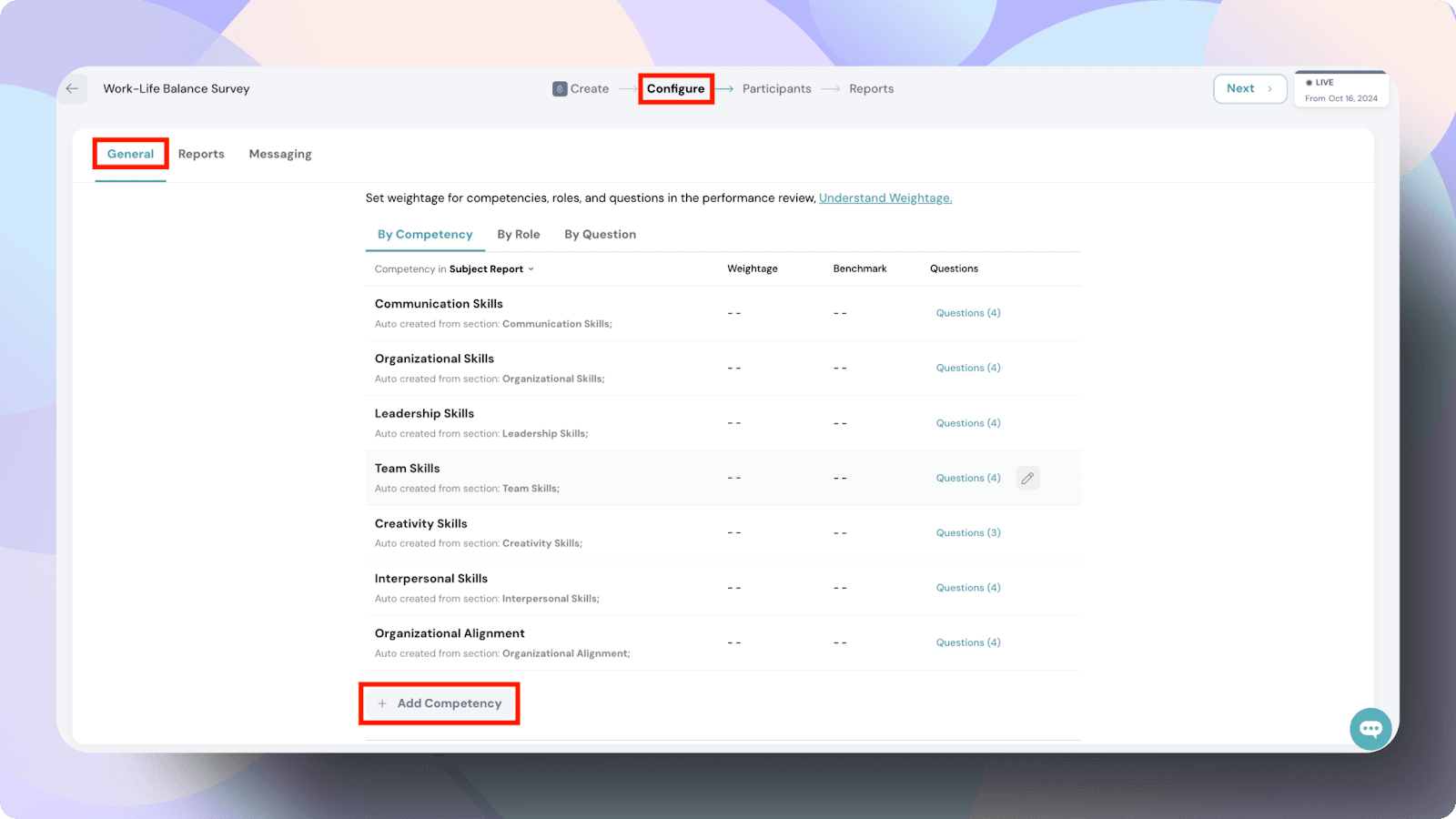
Step 2: Build and manage competencies
Navigate to Configure > General.
To add a new competency:
Click on Add Competency.
Fill in the required fields with the necessary details.
Click Save.
To update or remove a competency:
Use the Edit or Delete buttons next to each competency.
Step 3: Add widgets to your reports
Widgets allow you to visualize and organize your data in a way that gives meaningful insights. Here’s how to use them effectively:
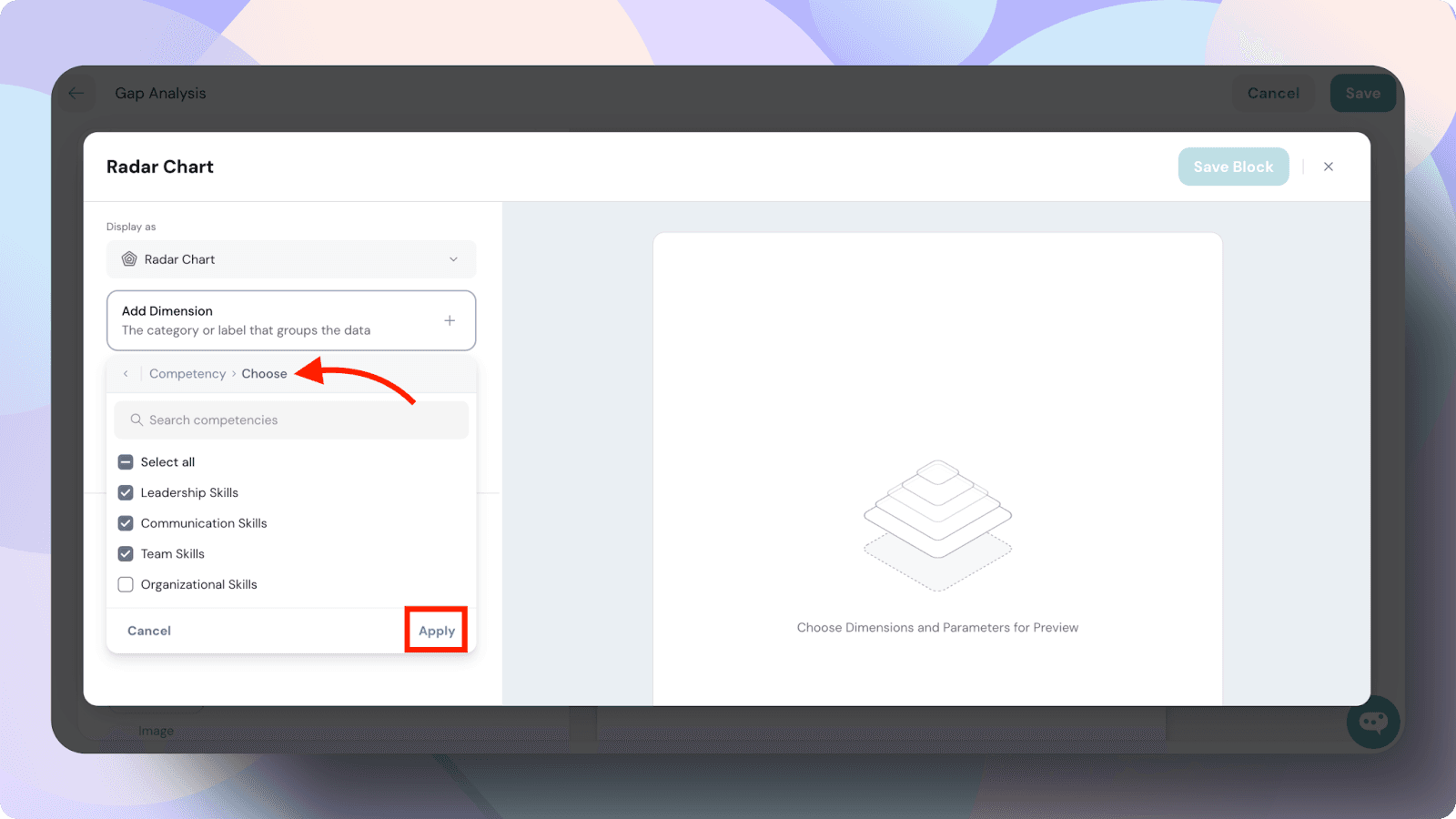
Choose your widget type:
Charts: Horizontal Bar, Vertical Bar, Radar.
Content blocks: Text, Image.
Pre-defined Tables & Charts: Scoring, Comparison, Gap Analysis, Feedback, Participants.
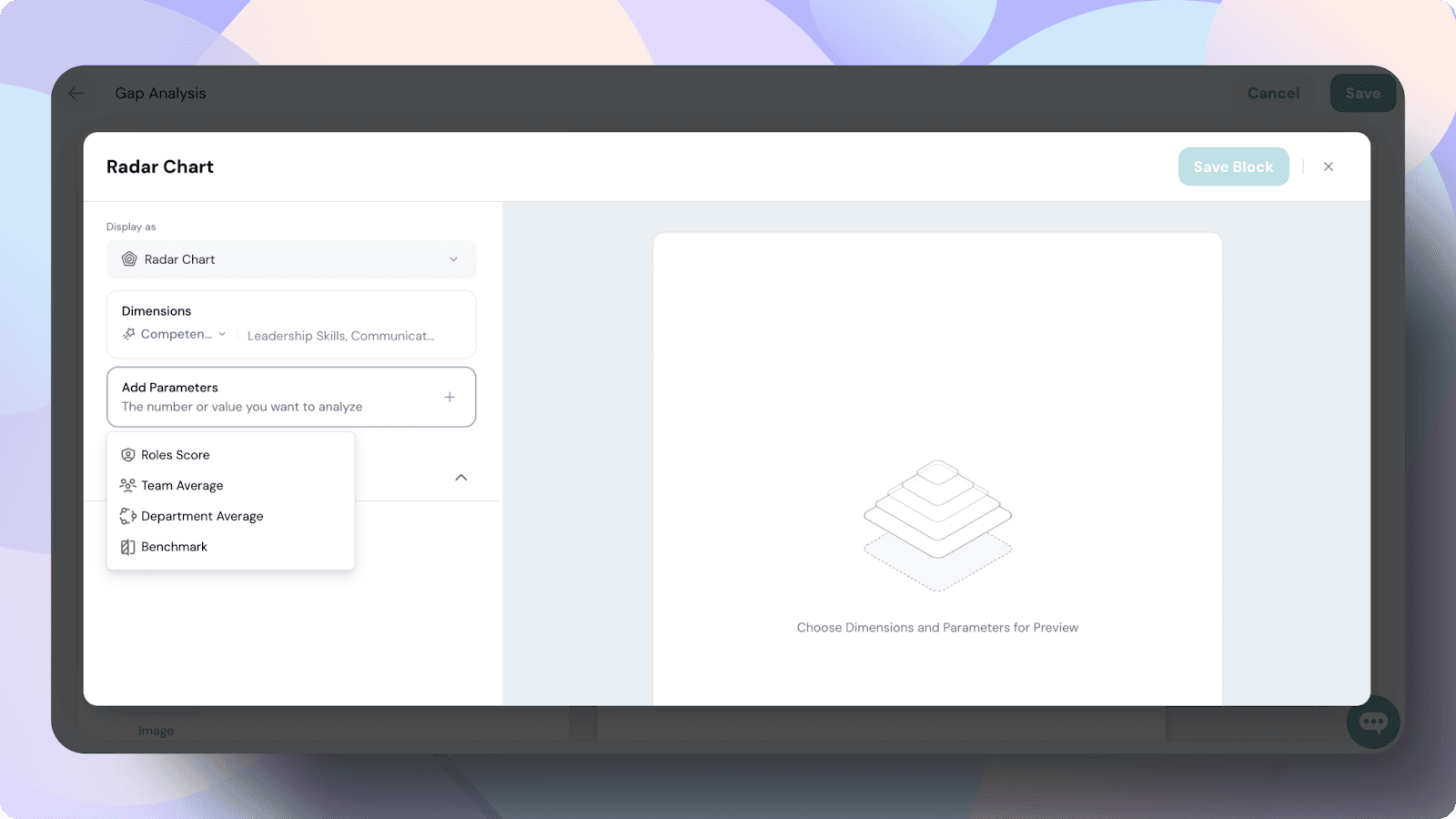
Set parameters for data visualization:
Adjust dimensions, such as Competencies.
Define parameters, like Scores or averages.
You also have the liberty to customize the reports by hiding descriptions, rearranging sections in ascending or descending order, or choosing what to display.
Preview real-time updates:
Changes will appear instantly so you can tweak your design on the go.
Add helpful context by including clear titles and descriptions.
Save your work:
Once satisfied, click on the Save Block button to lock in your changes.
Step 4: Customize your layout
Align your widgets to create a clean, professional look.
Add clear titles and descriptions to ensure your widgets are easy to understand.
Experiment with widget placement until you find the perfect structure for your report.
In advanced options for some content blocks, you also have the liberty to customize the reports by hiding descriptions, widgets, or rearranging them. You can even set thresholds for specific blocks to highlight key insights.
Content blocks at a glance
Here’s a quick overview of the widgets you can use:
Horizontal bar chart: Compare data side-by-side for quick insights.
Vertical bar chart: Visualize trends and category comparisons.
Radar chart: Spot blind spots and align team averages vs. overall scores.
Text: Highlight key points with concise explanations.
Image: Add visuals to make data relatable.
Scoring table: Summarize strengths and improvement areas.
Comparison table: Dive into performance contrasts.
Gap analysis chart: Address perception gaps and refine action plans.
Feedback table: Provide actionable, structured feedback.
Participants table: Track metrics for easy reference.
Interpreting your reports
Once your report is ready, it’s essential to understand what the data is telling you. Focus on the following:
Look for trends in the Radar Chart to identify blind spots.
Use the Comparison Table to uncover hidden strengths.
Leverage the Gap Analysis Chart to align action plans based on identified perception gaps.
Practical use cases for customizing your reports
Use case 1: Viewing gap analysis as a bar chart
If you want a clearer and more detailed view of your gap analysis, switch from the default radar chart to a horizontal bar chart. This lets you compare data side by side, making it easier to identify significant gaps.
Use case 2: Separating reports into soft skills and hard skills
Make your reports more structured by dividing them into two sections: one for soft skills like communication and teamwork, and another for hard skills like technical expertise. This separation makes it easier for your audience to focus on specific areas.
By following these steps, you’ll create reports that not only look great but also deliver meaningful insights. Happy customizing! Please feel free to reach out to us with any questions.